Error | Week Five : Visual Language \ Graphic Design
. . .
Focus piece
Riso print poster \ Communicating the joy of design
:
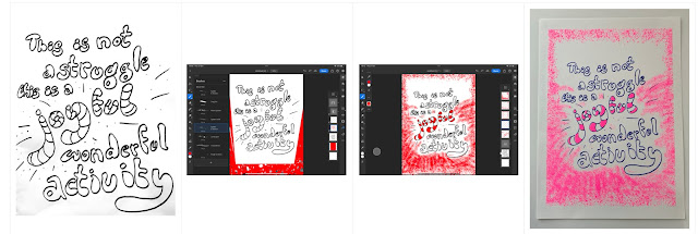
I remembered a sketch I’d made in my sketchbook last year, learning from Milton Glaser and his Dylan portrait. I’d jotted down a quote from an interview with him pointing out the Error in taking Graphic Design too seriously, reminding us that it’s a “joyful activity”.
I began by playing with the word joy and enjoyed the way the o and y could sometimes seem to form a winking, smiling face. I like the swooping energy and movement in the curve of the J and the y. However, when it was in the context of the word joyful and the full quote, I found that the smiling effect was lost.
I experimented with bringing in a contrast through the typography to emphasise the transition from struggle to joy visually as well as through the words themselves. I played with layout and fonts to find inspiration for hand-drawing and created a small folded book. But in the end it was my attempt at bubble writing that won out. I like the playful feel and the way the energy fills the whole page. The stripes have a cat in the hat joyousness to them.
. . .
In photoshop, I explored different pen tools to add duotone background and colour the stripes on the word Joyful. I played with the proportion using the distort tool but in the end decided to keep the balance of my original drawing. I kept the background clear around the first part of the quote, bringing in joyful energy with the spatter pen tool as a burst behind the joyful message.
. . .
Redrawing or working again I would look at the spacing of the words and lettering to improve the legibility. I want to learn from Milton Glaser’s talent for conveying exuberance with elegance, smooth the flow of the lines in the type. I would experiment with colour: I’d like to try the fleuro orange/cyan as in the V&A leaflet I picked up for reference.
. . .
I will include these things in my future practice:
. experiment with typed fonts and layout to inspire hand illustration
. high impact colour achieved with Riso print
\ \
Graphic design inspiration
I am drawn to circles, it seems!
\ \
V&A \ Hallyu Korean Wave \ Re:imagining Musical Theatre
https://www.vam.ac.uk/exhibitions/hallyu-the-korean-wave
https://www.wallpaper.com/art/hallyu-the-korean-wave-v-and-a-london
https://www.vam.ac.uk/exhibitions/reimagining-musicals


Comments
Post a Comment