Error | Week Two : Responding to Research
This week I
. . .
Tried a variety of sketching techniques; experimented in Photoshop; began to explore elements of visual language
. . .
Focus piece
Visual outcome responding to the theme Error:
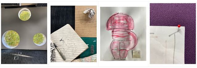
Continuing to explore the error in fashion design that takes size 10 as ‘standard’ and doesn’t accommodate the wide variety in women’s body shapes, I took inspiration from a Louise Bourgeois sculpture encountered at the Whitechapel Gallery. It reminded me of prehistoric sculptures of the female form and my research led me to an amazingly contemporary-feeling Cycladic marble figure held in the Met. I took this as the starting point in my experiments with a range of materials from pencil and charcoal sketches to paint and collage. I further researched ASOS size guides and the Croquis Figure, comparing ‘ideal’ measurements with those of the sculpture. For the outcome piece, I recalled how liberating I found it to work in marker on large-scale. I wanted to create a poster with a message that speaks for the curvaceous form that was once worshipped but now struggles to find a dress that fits.
. . .
Analysing my work, I feel the outcome piece perhaps is more of a work in progress sketch than finished poster. The vivid pink pops out of the tonal colour palette. The illustration has energy and the placement of the type works well with the image to emphasise the message.
Based on these observations, I want to experiment further with typography. Build skills in photoshop and illustrator to try different text approaches, clean/strengthen the background and optimise the illustration.
. . .
I will include these things in my future practice:
. working quickly on a large scale to capture the essence of an idea
\ \
Sketchbook notes
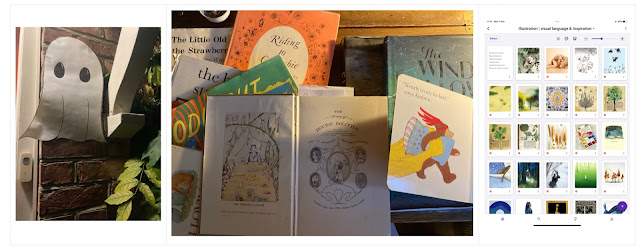
This week in my sketchbook I gathered inspiration for colour palettes.
\ \
Object Inspiration
My ‘error’ object was a scrunched-up piece of paper with words from a conversation I regret, crossed out.
. . .
The studies focusing on highlights, shadows are particularly striking; and the last sketch, on A3 paper in black marker, has an abstract graphic quality I especially like. I experimented to create some interesting effects in photoshop, removing background, playing with cropping and framing; adding photographs, text, and a layer of digital illustration. I like the contrast between the clean lines created by the graphic design elements combined with the spider-web of the hand-drawn sketches.
\ \
Next week I will
. . .
Learn how to reduce file sizes!


Comments
Post a Comment