Semester Two | Week Seven : Industry Brief

This week I explored emotion through colour, expression, and thought about ways to bring comfort through a simple story.

Responding to a brief that focused on design for two rooms in a ‘museum of emotion’, I transposed the directive to think about physical spaces to my own practice of illustration and storytelling. Rather than thinking about moving from an area of negative to an area of positive emotions, I want to create a picture book that helps the reader move from a state of anxiety to a state of calm.


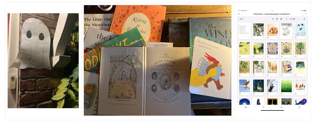
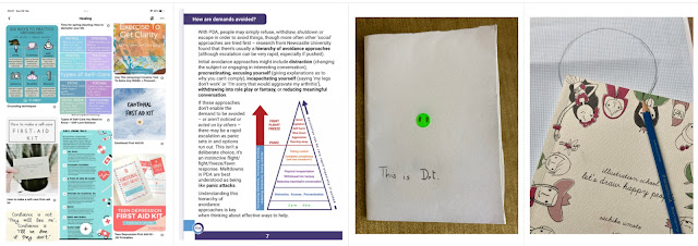
I began my research with focus on the technical skills I would need to approach the brief. I investigated Grid theory and Colour theory via brilliant resources at https://readymag.com/almanac/grid/practice/ and watched Youtube tutorials to further my skills in Procreate https://youtu.be/Vn8bj0YpZg4. I also revisited detailed research I’ve done in the past, into techniques for managing anxiety and to support teens on the autistic spectrum and/or with ADHD who may experience emotional dysregulation. I knew I wanted to develop a picture book text that I initially wrote inspired by my sister-in-law’s work with children in foster care. This text is out on submission to publishers as text only, with a mood board inspired by the bright primary colours and geometric shapes of Alexander Calder. This brief is a good opportunity to expand the pitch to include illustrations.


My illustration practice begins with pencil sketch on graph paper. Inspiration from Nicolas Menard’s animation Wednesday with Goddard (discovered via readymag) helped unlock how Dot might ‘hold’ a pebble. Menard worked with illustrator ManShen Lo and while Wednesday with Goddard initially reinforced my first intention to work in red blue and yellow, Lo’s striking use of pastel colours challenged me to revisit that intention and reminded me of my research into colours that are soothing, especially for those on the Autistic spectrum. 

I have experimented with hand-drawn type but think that a sans-serif font like Century Gothic or Avenir works better and is clearer to read. 

The colours reproduce very differently when printed, which is to be expected. The paper used is recycled with an existing grey hue. While the effect is beautiful on the full colour spreads, Dot gets a bit lost on the pale backgrounds. 

Next steps:

Recreate the world using dipped paint colours. I plan to animate the world giving Dot a hug (using Procreate) and will meet the spec of a ‘silent brief’ by having this ‘world hug’ as the poster element of the outcome.

Refine colours and backgrounds and revisit ‘spiky’ Dot (the fine strokes get lost).

I have also learned that it is wise to separate artwork into left hand and right hand pages, which will make layers a lot less complicated: I will revisit my files to organise them on those lines.

Comments

Popular posts from this blog

Final Major Project | Week Five : Development & Production

Semester Two : Week Eight / Industry Brief — Review & Reflect

Final Major Project | Week Three: Discover ii