Posts

Showing posts from October, 2022

Error | Week Five : Visual Language \ Graphic Design

Image
This week I . . . experimented with hand-drawn type | practised Photoshop skills | Learned to use the Riso printer . . . Focus piece Riso print poster \ Communicating the joy of design :  I remembered a sketch I’d made in my sketchbook last year, learning from Milton Glaser and his Dylan portrait. I’d jotted down a quote from an interview with him pointing out the Error in taking Graphic Design too seriously, reminding us that it’s a “joyful activity”. I began by playing with the word joy and enjoyed the way the o and y could sometimes seem to form a winking, smiling face. I like the swooping energy and movement in the curve of the J and the y. However, when it was in the context of the word joyful and the full quote, I found that the smiling effect was lost. I experimented with bringing in a contrast through the typography to emphasise the transition from struggle to joy visually as well as through the words themselves. I played with layout and fonts to find inspiration f

Error | Week Four : Visual Language \ Moving Image

Image
This week I . . . learned to edit images in photoshop | filmed using a gimbal | captured my handwriting as animation | began to explore premiere pro . . . Focus piece Short film \ Everything Becomes Clear :  Briefed to take inspiration from the classic Cool Hand Luke line “What we have here is failure to communicate” I wanted to make a positive message to help reverse that failure.  I’m interested in the popularity of lifestyle vlogs that combine uplifting words with beautiful videography and researched the methods of Thuy Dao and her vlog Her 86m2 .  Experimental footage shot on my iPhone drew me back to the striking lines and contrasting strong colour of the head sculpture near the University building, and I took advantage of the natural sunlight, finding a clean palette of red sculpture against the blue sky. The fractured composition of the sculpture lends itself to the message of the text and I shot upside down, tracking the flowing structure before pulling back to reveal the

Error | Week Three : Visual Language \ 3D Design

Image
This week I . . . learned to create images in illustrator | sketched inspiration from buildings around N.Greenwich | built maquette models to plan a shelter | worked in a group to build life-size structure . . . Focus piece Shelter-building group project :  Responding to the brief to create a waterproof shelter large enough to hold a person, strong enough to support the weight of a bag, we began individually by taking inspiration from architecture in the local area and generating ideas/designs. We then came together in a group of four and discussed a design solution bringing together effective elements from each of our concepts. . . . Analysing my work, I notice how beneficial it was to be able to draw on others’ skills ― Steve’s experience of wild camping, Aref’s carpentry background. We refined the design as we built, adapting in real time to observations of where the structure needed reinforcing. We adjusted the original concepts which tapered at the back to create a more sp

Error | Week Two : Responding to Research

Image
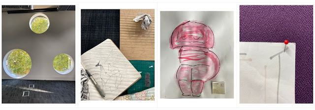
This week I  . . . Tried a variety of sketching techniques; experimented in Photoshop; began to explore elements of visual language . . . Focus piece Visual outcome responding to the theme Error :  Continuing to explore the error in fashion design that takes size 10 as ‘standard’ and doesn’t accommodate the wide variety in women’s body shapes, I took inspiration from a Louise Bourgeois sculpture encountered at the Whitechapel Gallery . It reminded me of prehistoric sculptures of the female form and my research led me to an amazingly contemporary-feeling Cycladic marble figure held in the Met . I took this as the starting point in my experiments with a range of materials from pencil and charcoal sketches to paint and collage. I further researched ASOS size guides and the Croquis Figure , comparing ‘ideal’ measurements with those of the sculpture. For the outcome piece, I recalled how liberating I found it to work in marker on large-scale. I wanted to create a poster with a messag

Error | Week One : Research

Image
This week I  . . . interviewed fellow Ravensbourne students for primary research | found local inspiration at the O2 mall . . . Focus piece Living Catwalk | Photographic Series O2 shopping mall 28.09.22 :  As a project in Primary Research, I began by interviewing a Ravensbourne fashion student about errors in clothes design; specifically about design for the wide variety of human shapes & sizes. Inspired by her observations, I photographed passers-by at the nearby mall. I looked for juxtapositions between glossy marketing images/displays and ‘real’ people. Editing the photographs into a series later, I selected shots where I had captured poses you might see in catwalk models and arranged them in pairs and trios unified by colour and theme. I took the photographs on my iPhone, designed the typography in Pages, and collected the series of images in Keynote. . . . Analysing my work, I notice how a research project evolved into a photographic project. Initially, I felt s